Venera AI
Helping people with chronic conditions manage their daily health through a centralized, AI-powered mobile application.
MY ROLE
Led comprehensive user research and UX design for chronic care self-management, including competitive analysis, user interviews, diary studies, persona and journey mapping, service blueprinting, IA, prototyping, and iterative usability testing. Also partnered with engineering on device and app integrations, and with privacy on consent and data controls.
TIMELINE
May 2024 — Jun 2025
PROJECT TYPE
Startup consumer product (iOS/Android), beta launched
IMPACTS
Projected $1M return in 2 years • Week-1 activation 62% • 3,000+ users in private beta by week 8
TOOLS
Figma • FigJam • Dovetail • Notion • Jira • Maze
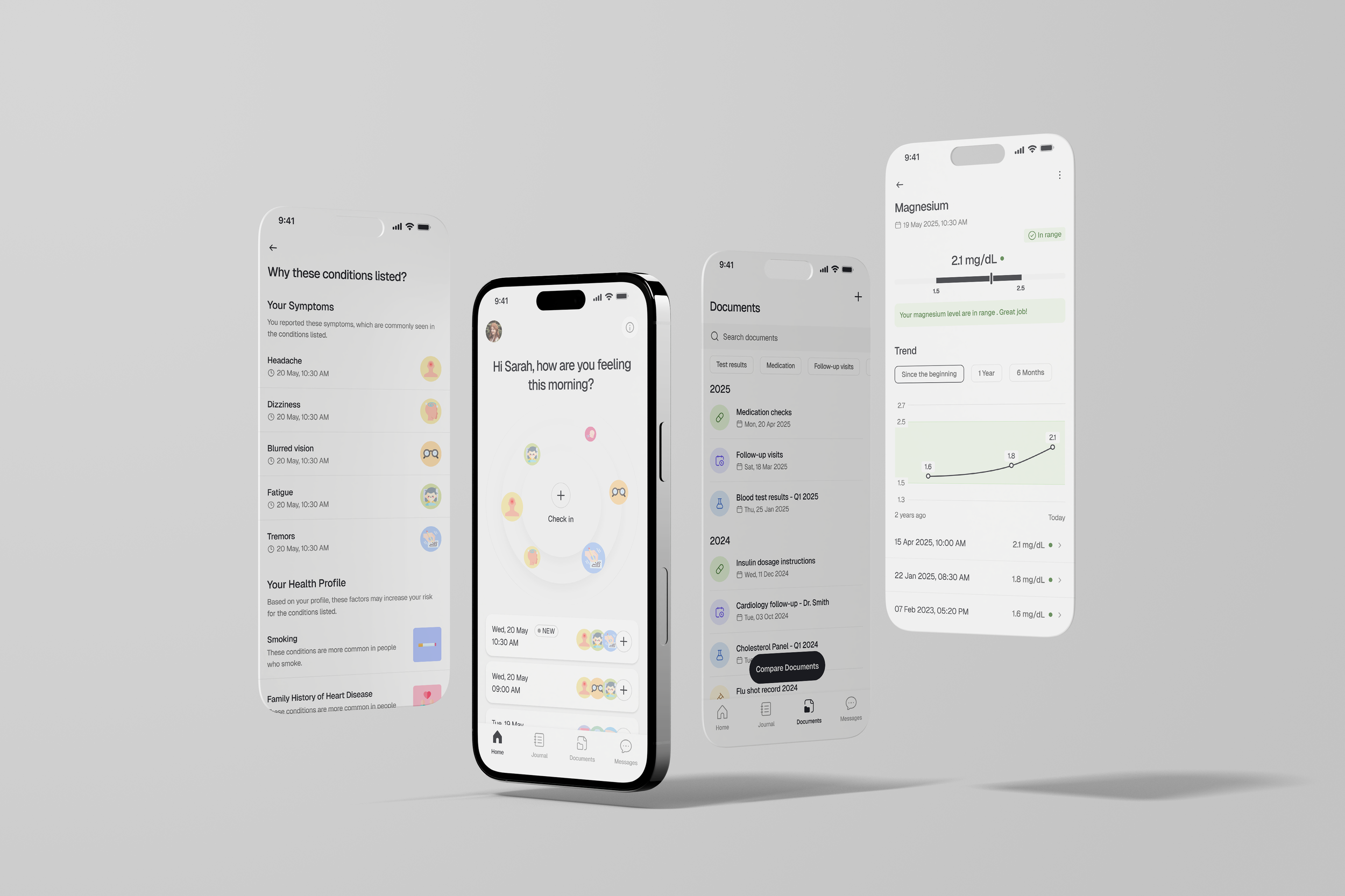
As a consumer health app, Venera AI set out to solve an everyday problem: people have data everywhere, such as wearables, home devices, and PDFs in multiple portals, but little clarity on what it means or what to do next.
Over nine months we built, tested, and iterated an app that integrates health data, simplifies medical reports, and adapts personalized plans around how users actually feel.
Problem
Users managing long-term conditions face two compounding barriers: fragmentation (results and vitals scattered across devices and portals) and translation (medical PDFs and charts that are hard to interpret). The outcome is anxiety, decision fatigue, and plans that slowly drift off track.
Solution
Centralized Health Dashboard
Connects to Apple Health, Google Fit, and wearables for steps, HR, sleep, supports quick entry for BP, glucose, and weight.
Securely uploads PDFs or connects to portals; merges reports from different providers into one consistent view.
Reports & Trends
Extracts and simplifies values from PDFs into readable summaries and graphs with trend analysis.
Tells users what the numbers mean, what they might do about it, and when to seek help; exports a one-page summary for personal records.
Personalized Plans
A 45-second Daily Check-In captures physical and emotional state, symptoms, and life context
Plans and goals for movement, food, and exercise adapt to the user’s long-term diagnoses and how they feel each day
Smart AI Assistant
Detects patterns from uploaded medical reports and device data, explains possible symptoms in plain language, and suggests what to try next.
Offers guided prompts and quick replies to remove blank-page anxiety.
Our Approach
01 Define
Understanding problem space • Outcome goals • Methods & schedule
02 Research
Competitive analysis • User surveys (150)• User interviews (35) • Diary studies • Contextual inquiries (portal logins, home measurements)
03 Design
Divergent concepts (3) • IA • Wireframes • Mid-fi → Hi-fi
04 Evaluate
Usability testing • 8-week beta • Behavioral analytics • Design recommendations
Research
We divided research into two phases. Primary research clarified stakeholders, the self-management lifecycle, and the state of existing solutions. Secondary research deepened context via diary studies and hands-on walkthroughs of portal connections and report uploads. We then synthesized everything into an affinity map that informed personas, empathy maps, journey maps, and early design ideas.
Understand existing solutions
We audited device ecosystems (Apple Health, Google Fit, wearables) and patient portals to understand where data flows break, how PDFs are presented, and the opportunities for auto extraction and plain language explanations.
Understand the data
We collected sample medical reports and lab tests (de-identified) to model extraction, normalization, and safe summaries, ensuring users see concrete next steps.
Real-world immersion
We shadowed users linking portals, uploading new results, and doing home readings. We observed where they stalled (jargon, confidence) and what revived momentum (short explanations, quick wins).
Analysis
We synthesized interviews, diaries, and observations into an affinity map to expose higher-order problems and opportunity areas: data fragmentation, translation gaps, and AI expectations.
Personas
Based on our user research, we created our three personas that represent different levels of tech literacy, health engagement, and trust in AI.
Journey Maps
This journey map illustrates the end-to-end experience of chronic condition patients in their self-management journey, highlighting their thoughts, actions, and emotional highs and lows.
Major Iterations
I led three major design iterations based on stakeholder input and two rounds of real-user testing. Each change aimed to improve usability, emotional connection, and clarity, particularly in health tracking, chatbot interaction, and medical report readability.
Redesigning for daily use
The first iteration of the home screen focused heavily on medical reports, but both user feedback and stakeholder input showed that this approach delivered little daily value. Users primarily engaged with daily check-ins, real-time tracking, and quick AI chats, while reports were only uploaded and reviewed after appointments, making the home screen feel passive and “too clinical.”
In the second iteration, we repositioned the home screen to prioritize real-time metrics, daily check-ins, and goal progress, making check-in and AI chat accessible directly from the home view. Medical reports were moved to a dedicated tab, with summaries only surfaced when there was a new update. In the third iteration, we redesigned the layout with friendly illustrations, warmer colors, and micro-interactions to create a more emotionally supportive and motivational experience.
Building trust in AI summaries
Our user testing feedback pointed to the need for greater transparency and empathy in how health information was presented. Users struggled to connect summaries with the original reports, felt uncertain about the credibility of terms and recommendations, and found the tone overly technical for a health sensitive context.
To address this, we introduced visual highlights on uploaded PDFs and images to clearly show where each summary point came from, added credible source links for medical terms and recommendations, and enabled tapping on metrics (e.g., Glucose: 87 mg/dL) to open a dedicated details screen. The tone was also rewritten to be more empathetic and approachable, ensuring explanations felt supportive rather than clinical.
Understanding the logic behind
Our user testing revealed that users valued personalization but often felt disconnected from why certain plans were suggested. Users wanted plans that adapted to how they felt each day rather than static, diagnosis-based recommendations, and they also struggled with knowing when to follow or override the app’s advice.
To address this, we added clear explanation labels to every plan, introduced a “Perfect For Today” feature that tailors suggestions from Daily Check-ins, included disclaimers when data was incomplete, and replaced unlimited plan saving with a one-plan-a-day approach to reduce decision fatigue.
Chatbot visibility & guidance upgrade
Usability sessions showed that many users hesitated to start a conversation because they were unsure what to ask and some even mistook the chatbot for tech or customer support. Meanwhile, stakeholders wanted the chatbot to be positioned as a core health feature. Users also sought quick, personal guidance when feeling unwell, preferring concise and empathetic responses over lengthy, clinical paragraphs.
To meet these needs, we introduced suggested questions to lower cognitive load, added a short intro message outlining the chatbot’s capabilities, moved the chat button to the top-right of the Home screen for greater visibility, and rewrote responses to be shorter, warmer, and more conversational.
Outcomes
We evaluated the impact of each iteration through a mix of usage analytics, in-app surveys, and targeted usability tests with both existing beta users and new participants. For each release, we identified benchmark tasks tied to the updated features (e.g., completing a daily plan, starting a chatbot session, reading a medical summary) and measured both quantitative metrics and qualitative feedback.
Usage analytics allowed us to track completion rates, feature engagement, and return usage over a 4-week period post-release. In parallel, in-app surveys captured user sentiment, focusing on clarity, ease of use, and emotional resonance. Qualitative sessions helped pinpoint why numbers moved, revealing patterns such as users feeling more confident when plan explanations were transparent, or more engaged when chatbot guidance felt personal.
These combined methods validated our design decisions, resulting in measurable outcomes:
26% increase in satisfaction after adding transparent data sources in summaries
38% rise in chatbot usage after repositioning and adding prompts
35% boost in plan completion from the “Perfect For Today” feature
Reflections
This project was one of the most comprehensive and high impact experiences of my career as a design lead, blending deep UX research with the complexity of healthcare technology. Leading the design for Venera AI meant balancing user needs, medical accuracy, and business goals, all while ensuring the product remained emotionally supportive for people managing chronic conditions.
Working closely with cross-functional teams was essential in turning a broad vision into a tangible, testable product. While stakeholders initially envisioned a feature set heavily focused on static health record storage, our user research revealed the need for more dynamic, daily engagement. This insight shifted the product direction toward features like “Perfect For Today” plans, empathetic AI chatbot interactions, and simplified medical data visualization. The changes that dramatically improved user trust and adoption.
One of the key takeaways was the importance of designing for sustained engagement in a sensitive domain. Chronic health management is not just about providing information but about delivering it in a way that meets people where they are, sometimes in moments of stress or uncertainty. Testing across a wide range of health conditions, tech literacy levels, and emotional states helped us ensure the product could scale across different user profiles without losing clarity or compassion.
Ultimately, this project reinforced that successful health tech design depends on empathy, evidence driven decisions, and constant iteration. The journey from early assumptions to a user validated, emotionally attuned product has shaped how I approach both product strategy and the fine details of interaction design.